FULL UX STUDY FOR AN EXPERT APP
ExpertEase
Get help or learn from verified Experts
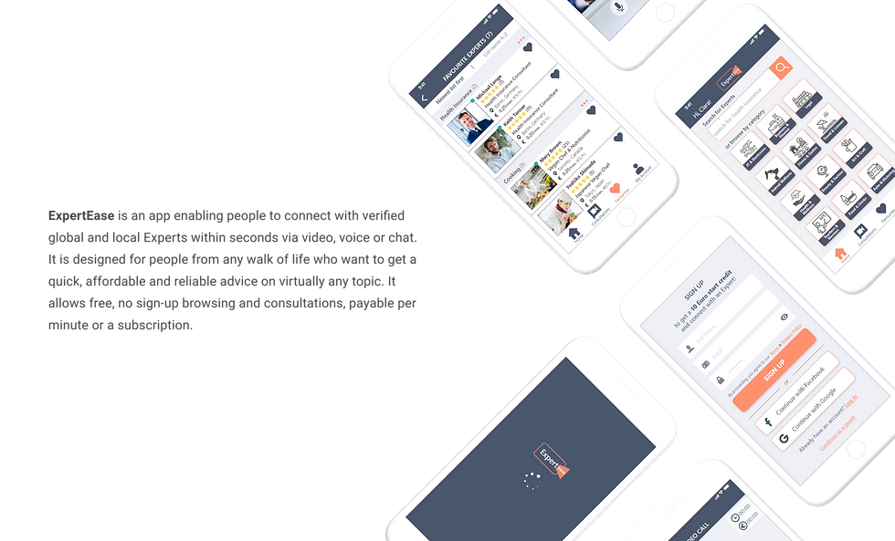
ExpertEase is an app enabling people to connect with verified global and local Experts within seconds via video, voice or chat.
It is designed for people from any walk of life who want to get a quick, affordable and reliable advice on virtually any topic.
It allows free, no sign-up browsing and consultations, payable per minute or a subscription.
During my UX Immersion course at CareerFoundry, I was given a task to create an app for Expert advice. Below I will share the main steps of the design process and how the app was developed from inception to final stage.
Role
UX Designer
UI Designer
Tools
Adobe XD
Balsamiq
Optimal Sort
Usability Hub
Duartion
Nov 2019 - May 2020
PROJECT BRIEF
Understand | Problem statement
The first step of creating the app was to establish its purpose. To achieve that, I defined the problems it aims to solve as clearly as possible, by including sufficient contextual details and establishing why it is important to address them. Then, I outlined relevant solutions for each and summarized all in a Problem and Solution statement.
Expert consultations are usuausually expensive and a lot of people cannot afford it.
Meeting an Expert in person is time-consuming, often can't be scheduled soon enough to resolve an urgent problem.
The info is a lot and scattered on countless online platforms, leaving a person overwhelmed and lost.
Questionable sources, it is difficult for the people to determine which one is credible.
The online advices may not be applicable to a person's place of living - products, legislation etc. could vary from country to country.
People have diffdifficulties formulating their questions, not knowing the specifispecific terminology and where to begin.
PROBLEMS
Free-to-browse app with affordable Expert consultations, payable per minute or via subscription.
Online chats/ video calls with Experts from around the world at any time of the day.
1 platform with concise and well-organized info by topics, presented in intuitive, easy to navigate way.
Procedure to verify the Expert's credentials. Also, display ratings by other users.
Option to find local Experts for resolving location-specific issues.
Browsing and searching should be easy and intuitive, with relevant search suggsuggestions.
SOLUTIONS
PROBLEM STATEMENT
When trying to resolve various problems, it is challenging for the people to find a fast, affordable and reliable way to connect with trustable Experts. They struggle to formulate their search and skip from platform to platform, wasting a lot of time. The information they come across could be irrelevant to their situation or place of living.
SOLUTION STATEMENT
Creating an app, which offers a well-organized, simple and intuitive way to browse and connect with global experts on virtually any topic. The users should be able to quickly and reliably resolve problems via consultaion with verified professionals, selectable by rating and location. The app should be free to browse and provide affordable 1-on-1 chats or video calls, payable per minute or via subscription.

Understand | Competitive analisys
The next step was to research direct and indirect competitors.
The aim of the Competitive analysis was to get informed about best existing practices, strengths and weaknesses, and what could be done better to differentiate my design from similar platforms in order to fulfil the users needs.
After reviewing a number of similar platforms, the 2 most relevant to my project were selected for in-depth analysis - The One expert and Udo.
Below you can see some of the information included in the Competitive analysis for each app:
-
Overview & Key objectives
-
Business profile
-
SWOT profile
Explore the slides and click on each for a detailed view
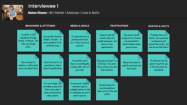
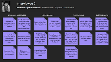
Observe | User interviews
Conducting qualitative user research through Interviews, helped to better understand the potential users - what they do, feel, think.
The feedback gave valuable insights for identifying certain capabilities and features the app should provide.
Most overlapped with my initial hypothesis, which gave me confidence to continue the development in that direction.
See the User Research Analysis process below.


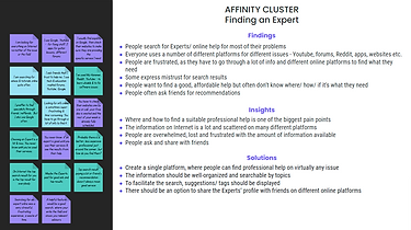
Click on each for a detailed view


AFFINITY MAP & CLUSTERS
Empathize | User personas
All the information collected by now was consolidated for the birthing of the 2 User personas and their User stories. They are fictional characters, representing the user types that might use the app. Creating them will help to keep my focus throughout the rest of the designing process anchored on addressing their needs and accomplishing their goals.

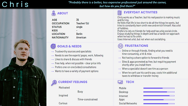
Click on the persona cards for a detailed view
Empathize | User journey maps
At this stage I knew who are my users.
I put myself in their shoes and mapped out how they might interact with the app on their journey to find an Expert. Each was divided into phases, containing the thoughts and emotions they might go through while navigating the app. This allowed me to better understand possible pain points and address them accordingly to create more enjoyable experience.


Click on the journey cards for a detailed view
Ideate | User flows
It was time to create feasible solutions for the User personas' pain points by identifying particular tasks based on their User story and the “happiest” route to achieve them while navigating the app. Each contains an entry point and set of action steps leading to a successful outcome.
Creating the User flows helped me identify the steps and the interrelationships between them, aiming for a smooth flow.
See the 3 flows below.
Ideate | Site map
The purpose of the map is to visually list all the screens of the app and the connections between them.
Every box on my Site map got its place, based on what the users had to say.
I listened, combined and shifted during the User interviews, Research analysis and Card sorting tests, to make sure all user needs are covered.
Later on, it was revised several times for better coherence. The version that you see below is the final one.
SITE MAP

Create | Wireframes
It was time to put pen on paper and start sketching. The aim was to recreate the steps of the User flows and 3 main features, the ones most important and overlapping between the User Personas: Filter & Sort Experts list, Video-call an Expert, Send a file during video call.
The wireframes were compiled in Low-fidelity prototype and later on upgraded to Mid-fidelity one using Balsamiq and Adobe XD software.
VIDEO CALL - SKETCH
Home screen

Favourite experts

Expert profile
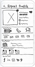
Video call connecting

Video call connected

VIDEO CALL - LOW-FIDELITY
Home screen
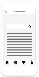
Favourite experts

Expert profile

Video call connecting

Video call connected

Test | Usability tests
Planing
At this point I had my mid-fidelity prototype with 3 key features, onboarding and sign-up screens.
It was time to validate my decisions by conducting Usability tests. Potential users were recruited to navigate the app while I observe their behaviour. In order to define the whole process and ensure consistently guided tests, I created a Test plan and Test script.
USABILITY TEST PLAN

Analysing
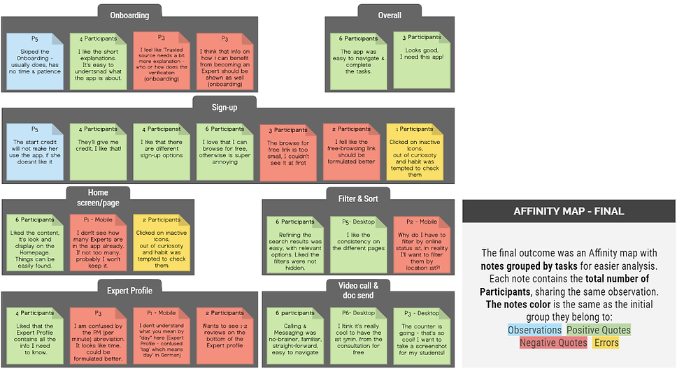
After a thorough review of the sessions recordings, I created an Affinity map, which helped me to lay out the large amount of data I had from the tests and organize it into themed groups, based on their relationships - "Observations", "Positive quotes", "Negative quotes", "Errors".
For convenience, I additionally grouped them into "Screens" by keeping the colours of the original groups for reference.
The aim was to write down, group and analyse all relevant verbal and non-verbal feedback & observations I had from the participants.
See the process below.
The condensed info was then transferred to a Rainbow Sheet report and assigned an error rating, which I will use as guide for improvements.
For a detailed look at the test results, feel free to explore the Rainbow Spreadsheet report: Rainbow Spreadsheet Link

Results and Iterations
All participants were able to complete all given tasks. In the follow-up questions after each task, all participant expressed that the tasks were easy or very easy to complete. However, the provided feedback was not only limited to the successful completion of the given tasks. It revealed some valuable insights and potential issues, which need to be considered and appropriately addressed.
5 issues were identified, assigned a severity rating and changes made to improve the user experience.
USABILITY TEST ITERATIONS
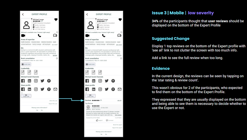
before
after
Test | A/B preference tests
I wasn’t done with the tests yet. Striving to constantly improve the design and provide the best possible experience for the users, I run 3 A/B preference tests through the online testing platform Usabilityhub.com.

A/B PREFERENCE TEST 1
Create | Design documentation
To safeguard the design’s visual integrity, keep it consistent throughout and make the elements easier to reuse, I built a Style guide documentation.

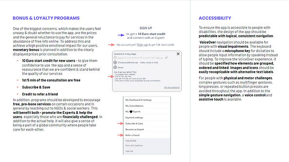
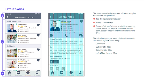
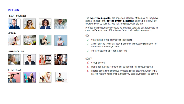
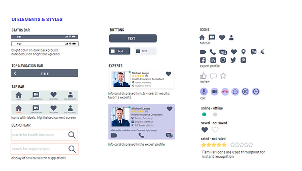

High-fidelity prototype
The High-fidelity prototype was further tested and feedback provided by peer reviews. It received mainly positive comments and only minor changes were applied.
After all the stages of building, analysing, testing and improving, the final prototype was ready, hopefully fulfilling its purpose - to deliver seamless and pleasant user experience.


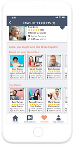

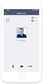
Click here to explore the final prototype and see a demo video below.
Final thoughts
The time spent on the project and creating the app was a valuable, rewarding experience. I learned a lot about the whole UX design process - how to apply relevant methods and tools in order to build, adjust and upgrade it. All done with the users in mind, aiming to provide the best possible experience.
In addition to the soft skills, I learned how to utilize programs, needed to complete the tasks.
The main challenge I had was to quickly learn how to use the design software I had zero experience with, so I can visually represent what I wanted. Another challenge was to avoid obsessing with small details, which could not necessarily be important for completing a certain task. Striving for perfection and attention for details is important in my work. However, instead of trying to find a perfect solution (which is a subjective, changeable concept anyway) in one go, it is better to do it in smaller cycles. This will ensure a faster delivery of a given task.
Just like the design of the app, which could always be further improved, learning for me is a never-ending process.
It is an open-end journey with always something new to learn, improve and build upon my current knowledge.
I am looking forward to that with great excitement.
Thanks for viewing!
If you like my work and want to employ me for your project, feel free to contact me.


